Forsaken - BAB
Image: Nintendo Life

Greetings, and welcome to another edition of Box Art Brawl!

Last time, we checked out the original Harvest Moon for the SNES, and would you believe it, it was actually the more realistic European design that won the day with 46% of the vote. North America was the runner-up with 34%, while Japan only managed 20%.

This week, to celebrate the launch of Forsaken on Nintendo Switch Online, we're going to look at... Forsaken! Madness. Yes, originally launched in 1998 from publisher Acclaim Entertainment, Forsake was relatively well-received for its first-person gameplay and was given the remaster treatment by Nightdive on other platforms back in 2018.

Forsaken didn't launch in Japan, so we're back to a two-way duel this week with North America going head-to-head with Europe. Let battle commence.
North America

Forsaken - NA
Image: Acclaim Entertainment / LaunchBox

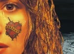
The North American version of Forsaken features model Donna DeCianni sporting a rather unsavoury 'Forsaken' tattoo on her left cheek, which is probably why she's shedding a tear, to be honest. The background looks a bit barren; almost like it's been ripped from the world of Death Stranding, or something. It's a recognisable piece though, even if the game's logo isn't necessarily that impactful.

Europe

Harvest Moon - EU
Image: Acclaim Entertainment / LaunchBox

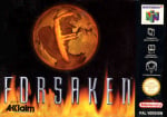
The European version features a much cooler font for the game title itself, though it's fair to say that the overall composition is maybe a little barebones. You've got what looks like a bronze-coloured globe with the letter 'F' imprinted on the front, with flames rising from the bottom of the box to surround the game title.


Which region got the best Forsaken box art?

Thanks for voting! We'll see you next time for another Box Art Brawl.